Go City
Role: Design Director at DiGo
Services:
Brand Identity
Logo System
In-depth Brand Guidelines that included direction for color systems, typography and hierarchy, stock photography, iconography, etc.
Website Direction
Sales Collateral Direction
App and Pass Direction
Collaborated with Art Directors to ensure campaign felt true to the updated brand.
Client Overview:
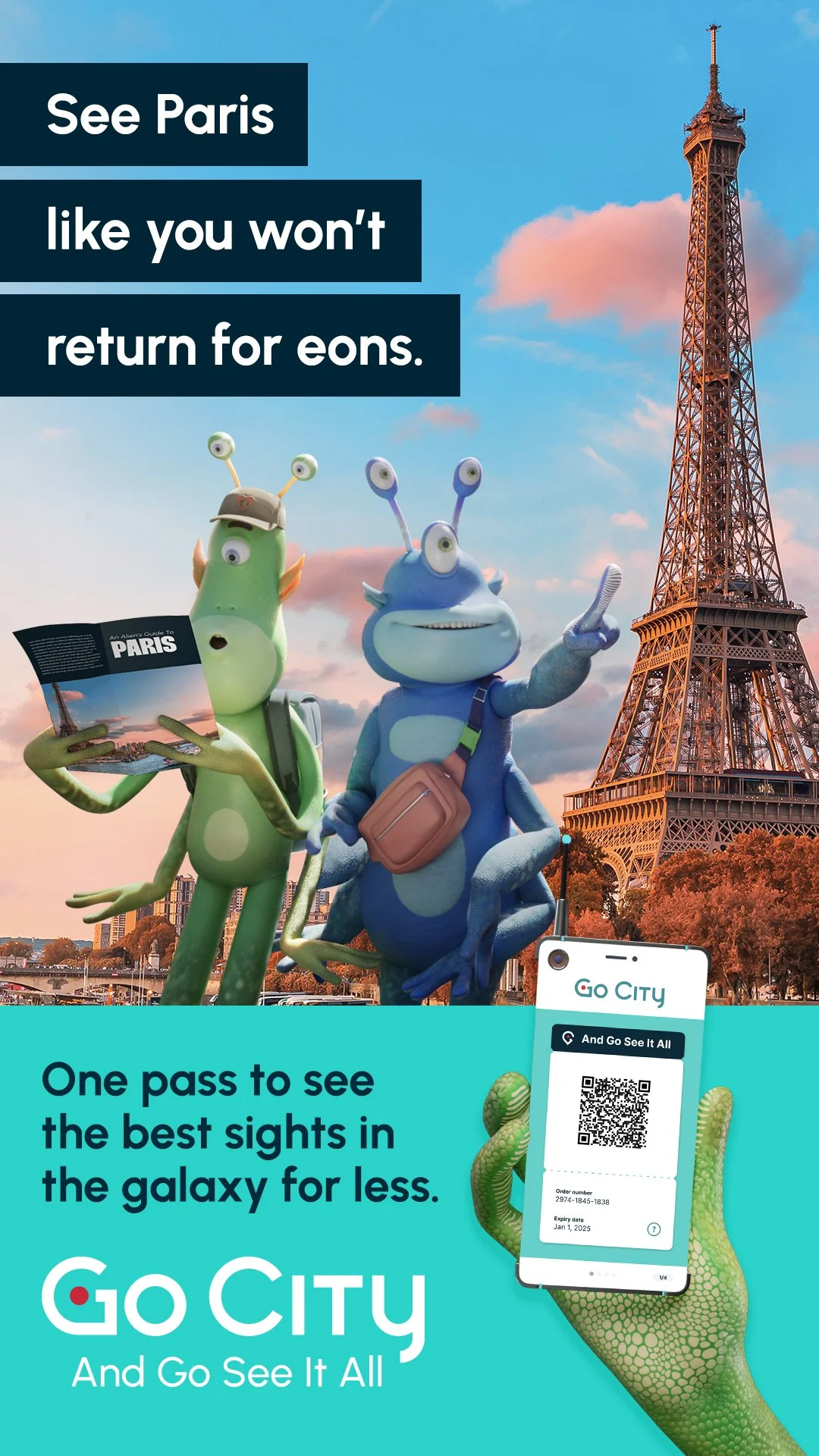
Go city is transforming the way you see and experience the world’s greatest destinations. With their sightseeing passes, visit bucket list attractions, enjoy top tours, and discover plenty of hidden gems - all of which are hand-picked by local experts. Plus it’s one price, one pass, and everything you need, right there on your phone.
The Challenge
Go City is the leader in the multi-attraction pass category, but there’s just one problem: most people don’t know what an attraction pass is. And as we look to the (near) future, now is the time to establish Go City as THE go-to app for city travelers.
The Solution
Create a brand identity that feels optimistic, energetic, & approachable - like it’s coming from a “friend in the know” (clever, inviting, go-getter). It should look clean & modern, indicating a seamless & innovative customer experience, as well as use design elements that can flex to various formats & channels, including the app icon. It should also help breakthrough in the category.
Along with a new brand identity, DiGo was tasked with creating a new awareness campaign to launch Go City’s new direction and future.
Logo Design
Rationale
The inspiration behind this concept was the various attractions and locations that customers will experience using the Go City app. The “G” is a location pin that gives us a unique and own-able icon when turned on it’s side for the app widget. The type kept clean, modern and legible to pay homage to Go City’s history.
Read more here.